
I have a slight fascination with logos and typography…enough so that this blog has a Logos, Signs, Typos category. It’s no surprise that, having worked for a network of NBC affiliates for nearly a decade and a half, I have been experiencing a sort of deja vu whenever I encounter one of these clinic advertisements around town. Something about it just repeatedly caught my eye. I pondered it briefly the other day, and realized why. I delved back into my toolkit of assorted NBC logos and made a little overlay…
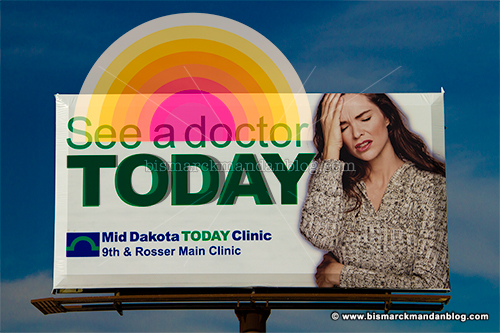
Coincidence? Probably. Sinister conspiracy? Doubtful. I just find it interesting how simple shapes and typography can give us such strong, persistent visual cues. Besides, at least it’s not another doggone leaf.