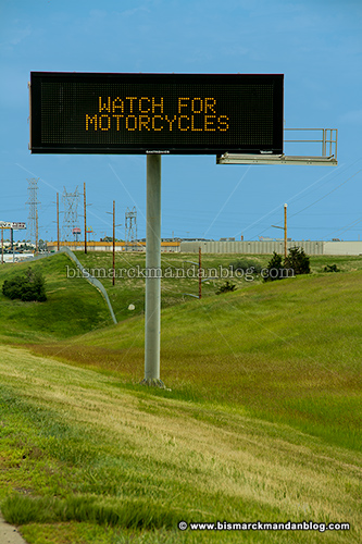
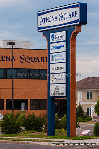
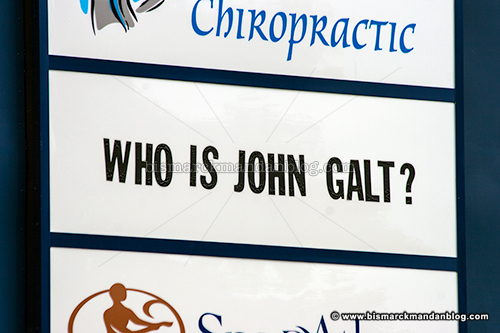
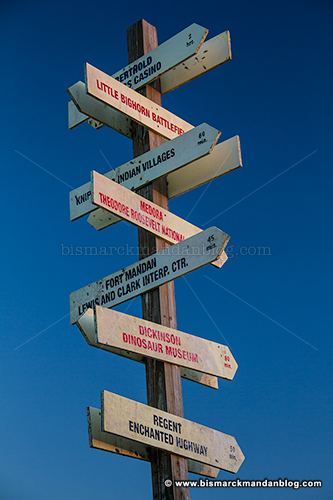
They missed a piece when they tore down Meriwether’s

Despite the efforts of my friend and Burleigh County commissioner Mark Armstrong, the city tore down the former Wilton train depot, known for the past twenty-plus years as the Meriwether’s building. It also doubled as the ticket office and souvenir for the various incarnations of riverboat which docked thereby. One interesting feature in the area was the sign you see above, which the Big Muddy decided to relocate far south during its flooding rampage last year.

It was Mark, in fact, who tipped me off to this sign last year already. Obviously it’s taken me quite a while to find the time to get down there and see it up close for myself. I finally did, however, while taking my little boys on a sandy walk to throw rocks into the water and enjoy a warm sunset. Someone apparently found this sign, which had been washed from the vicinity of the Grant Marsh bridge to a sandy stretch well south of the Memorial Bridge, and decided it to stick it into the ground. It’s stayed there ever since, a testament to its resilience.

As far as the plight of the Meriwether’s building goes, I can’t say I have any feelings one way or the other about it. The last restaurant I remember in the building was driven out of business by the closure of River Road when a section slid, and I can’t remember anything ever taking its place. The building is a pretty remote location for a business in all but the warmest few months, so I’m not sure it would have been a good candidate for business even if it had been restored.

I was on board one hundred percent when Phil and Mark were the super-duo on KFYR AM 550 radio and they set about preserving the Provident Life Weather Beacon. That’s a piece of history well known to thousands of people, one which many of us still consult when we want a snapshot of what the weather forecast holds in store. The old depot down by the river? I’m not sorry to say that I doubt many people held the same attachment to it. Sure, there were parts of it that were pretty cool…but one of the best of those has found itself a home about a mile down the river.
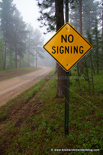
What about the hearing impaired?

I came upon this sign on Friday, one which presents two separate quandaries depending on your interpretation. First: a sign saying no signing? Gotta love the sweet irony of that one! Second: do they have a problem with the hearing impaired? After all, how are they going to communicate? I find this sign horribly discriminatory against people with disabilities in that regard. Signs are often a great source of humor, and this one provides multiple opportunities.

I just thought of something *gasp* – what if it’s also a typo, and they really don’t like singing?

This “Vanishing American” didn’t vanish…he just moved to U-Mary

Long, long ago on one of our “urban assault” mountain bike rides, I encountered this artwork with some friends of mine. It was late at night and we were biking past the Gold Seal Building since I used to rent an apartment nearby. I remember thinking that it was really cool, but this was long before I got into photography and I never thought to get a picture.

Later on when I bought my first camera and was looking for cool things around town to photograph, a vague recollection of something really cool on the wall of that building with the gold mirrored windows popped into my head. I drove by and examined the building from multiple angles, but sadly it was gone. I was sure I remembered it, but perhaps it had simply been removed? That would certainly be a shame…but in any case, it was no longer there.

A couple of weeks ago I went for a walkabout with a friend who worked in the Gold Seal Building back when it was leased by the MDU Resources Group. I mentioned that building and the etched stone artwork I thought I remembered, and he knew instantly what I was talking about. “That was moved out to the University of Mary,” he revealed. Joy! I knew then that I somehow had to find that slab of stone which had eluded me for so long.

A quick trip out to the ACC Art Show a couple of weekends ago gave me the opportunity to ask someone at the desk of the Harold Schafer Leadership Center if they knew what I was looking for. Naturally they did, and they led me to a concrete patio on the lower level of the building. Voila’ – here stands the stone I was seeking, looking boldly over the Missouri River to the west. Score!

I guess I can cross this one off my Bismarck-Mandan photographic “Bucket List” and move on to the next one. Thankfully this piece, commissioned by Harold Schafer himself, was preserved. It’s available for anyone on campus to see, but it’s in a location that isn’t readily obvious. The best way to find it is to wander the lawn to the west of the Tharaldson Business Center and saunter slowly southward toward the back of the Schafer center. Once you get to the right area you can’t miss it, unless of course you’re overwhelmed by the stunning view of the Briardale woods and Missouri River valley below.


Oh yeah…about that new AP logo

I forgot to mention this a while back, but I found it noteworthy that the Associated Press chose a new logo about a month ago, after thirty years with the previous version. Personally I prefer the 1981 model, but I’m not a credentialed graphic designer. Regardless, it looks like someone got paid a lot of money to create the new logo…one which shows no relationship between the A and P and tells nothing about the Associated Press. That got me thinking, and after about thirty seconds I had brainstormed a version of my own:

I stayed with the same A and P that their new logo uses, since they probably paid a lot of money for it. In an effort to generate a logo which actually says something about the Associated Press as an institution, I decided to add some text and a tag line which serves as a mission identifier as well as a design element. It may look familiar to you, which is intentional:

Since the AP as an institution pretty much acts as a stenographer and cheerleader for the Democrat Party, I figured it would be fine to graphically allude to the affiliation. After all, stories which are inconvenient to Democrats are spun or buried entirely, while industry-standard techniques are used to mock and vilify conservatives wherever they may be found. I know of a few notable standouts that don’t fall into this depiction, a few bright stars who actually practice journalism, but we’re talking about the AP as a whole here.

Sadly, I don’t think my version of the AP logo has a chance. It would be a great example of truth in advertising, but for now I guess we’ll just have to let the AP’s words depict their agenda instead of a simple graphic representation.
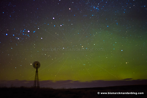
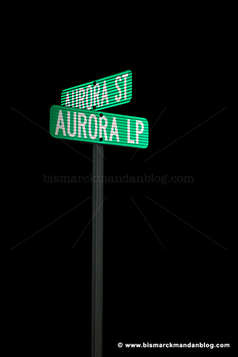
Out for a spin, and the most unique aurora photo I’ve ever taken

I decided to go out on a limb and head out on this breezy night in the hopes of seeing some auroras. I spotted a dull glow in the northern sky and set up to take a quick shot. As you can see from the blurred windmill, the breeze was blowing tonight. The auroras didn’t ever do anything for me other than cast a dull green glow near the horizon, so I started coming home. I did, however, spot something really cool…

Too bad I couldn’t get the Northern Lights in the background of this shot, because that would simply be too darn cool. I could Photoshop it, but that’s not how I operate. In any case, I came home with a unique “Aurora” photo to show you!

In case you need another reason to obey those NO TRESPASSING signs

I’ve mentioned before on this blog many times before that, when encountering posted land on which I’d like to “do photography” at some point, I always seek landowner permission. North Dakota state law requires that the landowner include their name on these signs to make them valid, which makes it easy to find them and place a respectful call asking for permission. Only once have I ever been told no – the guy was clearly drunk and didn’t believe that photography was the reason I wanted to tread upon his land.

I had to chuckle when I spotted this sign in an extremely remote location. In fact, after two weeks my truck is still dropping mud from the section line road adjacent to this property. I don’t even recall whether or not there was some old dilapidated farmstead or other intriguing subject beyond this sign…I simply remember finding the annotation quite amusing. I don’t think I’d want to test the landowner’s resolve, either!

Moon upon the left

So there I was: blazing down a gravel road at sunset, working my way back toward town. The sun had descended past the horizon, with only the purples and pinks in the eastern sky remaining for another couple of minutes. It’s a magical, fleeting moment that occurs after the brilliant, blazing light of the sunset has passed…and it’s a marvelous window of photographic opportunity in its own right.

That’s when I saw this sign, locked up the brakes, and hopped out into the ditch with my camera and tripod. I had to wander a bit to get just the right angle, but it wasn’t difficult. I had just enough time to try a few exposures before the light began to fade.

If you’ve read this blog for a while, you know that I often like to make musical references in the title of my posts. In this case, I’m referring to the song by folk singer David Mallet. Here are a couple of lyrical samples:

There’s a moon upon the left,
And there’s a star upon the right.
There’s a nightingale a singin’
To the wondrous summer night.
There are gentle deer a grazin’
In the meadow with no fright.
And there’s no past and there’s no future, only now.
We have chanced upon this fragile scene somehow.

Now there’s a cottontail a’watchin’,
O’er his lady as she sleeps.
I’m a lover of tradition,
Here’s my heart it’s yours to keep.
Won’t you take me as I’m giving,
We’ll be lovers in our flight.
Cause there’s a moon upon the left,
And there’s a star upon the right.


The days are already getting longer and even though (presumably) we’ll have a cold snap to brave our way through before winter’s over, those calm moonlit nights are just around the corner – perfect for those hand-holding walks with my sweetie. Soon, I tell myself…soon.

A special calendar…just for me?

I really appreciate when local print shops do certain things such as in 2011, when Image Printing made those posters with the American flag on them and distributed them around town. One other thing they do, and this is a good business tool as well, is distribute free office calendars as a promotional item. They’re very handy, high quality, and should be appreciated as a valuable gift.

I was taking down my calendar from last year (although I discovered it had 2012 on the back) to replace it with a new one, when I spotted something interesting: at the bottom of 2011 it also had smaller boxes containing Janaury and February 2012, for those of us who don’t change our calendars on time! Wait, what? Janaury?

Yes, mine had January misspelled on it. I checked the back to see if the same quirk existed on the 2012 side (with little January and February 2013’s on it), and it did! As a proofreader I found that noteworthy, so I checked other calendars in the building which hadn’t yet been replaced. As it turns out, I’ve got the only one with the error. Hmmmmm…that’s odd.

In addition to the giant poster-sized calendar, I also had an 8.5×11 version. That had the misspelling of January as well…yet I couldn’t find another calendar with the same typo anywhere! Weird.

I’m one of those people who could look at a printed page and have any typo errors leap off the page at me almost instantly, as if I was looking at one of those 3D computer-generated posters. As a result, I find it appropriate that I seem to have the one calendar with this particular feature.

Before any conspiracy theories abound, I’d like to point out that this calendar was hung three months before I moved into the office where it was hanging. I don’t believe in fate, but if I did I would surmise that perhaps this calendar and I were meant to find each other!

If this is your clinic, the folks at Rockefeller Center may want a word with you


I have a slight fascination with logos and typography…enough so that this blog has a Logos, Signs, Typos category. It’s no surprise that, having worked for a network of NBC affiliates for nearly a decade and a half, I have been experiencing a sort of deja vu whenever I encounter one of these clinic advertisements around town. Something about it just repeatedly caught my eye. I pondered it briefly the other day, and realized why. I delved back into my toolkit of assorted NBC logos and made a little overlay…

Spooky resemblance. It’s not 100% identical, but certainly close. I suppose it doesn’t help that the “rainbow sun” (as NBC in-house designers call it) bears a geometric relationship to the arch next to the Mid Dakota logo. Maybe the lady on this billboard has realized the resemblance!

Coincidence? Probably. Sinister conspiracy? Doubtful. I just find it interesting how simple shapes and typography can give us such strong, persistent visual cues. Besides, at least it’s not another doggone leaf.

You spell it Hogue, I spell it Hoge…let’s call the whole thing off

So I’ve been politely poking fun at KFYR-TV and others like my friend Mark who keep referring to “Hogue Island” online. I’ve always known the Hoge Island Boat Landing, the Hoge Field model aircraft club, and the like…so where did the U come from?

Bringing this up to Mark, he told me to “read the signs!” Always willing to double check myself, I decided to take the long way home after work and investigate. Guess what: Hoge. Look above and see for yourself. Case closed, right? Nope.

It looks like these signs have been corrected to indicate “Hoge Island” but did originally say “Hogue”. You can see from this photo where the “ue” has been covered and replaced with an “e” to alter the spelling. Did the makers of the original sign make the same “error” that Mark and others have made? Not quite…it appears there may be some actual contention on the spelling.

I was hoping that it might be as simple as looking for a Hoge Township on the Burleigh County map (PDF), but sadly that did not yield the intended result. Burleigh County itself refers to the area as Hoge Island. So how do I try to get an authoritative, definitive answer?

Well, while I’ve actually been wondering about this since late May or early June, it turns out that the Bismarck Tribune has been on top of it. They did this story on the matter back in June and discovered that two branches of the family which once owned the land in the area spelled their last name in two different ways. So we’re BOTH right. Thanks to Chris Bjorke for the legwork on this one.

I knew a guy in college whose last name is Hoag. I wonder if he’d want to chime in on the matter